Manet (23 January 1832 – 30 April 1883) was a French Modernist painter often referred to as the father of modernism. He was a crucial figure in the change from Realism to Impressionism and was close friends with other pivotal figures of the time such as Renoir, Monet and Degas, meeting the latter as early as 1859, when the pair would be found together copying paintings in the Louvre as practice. Publicly, Manet was a divisive figure. He was rejected year after year by the Paris Salons, a professional art society which was seen as the quickest way for artists to obtain recognition. The Paris Salon first gave Manet recognition for The Spanish Singer (below) in 1861 but then steadily rejected his submissions. This was perhaps compounded by Manet’s scandalous 1863 painting Déjeuner sur l’herbe, which depicted a nude woman enjoying breakfast with two fully clothed men while a second is returning from a bath in a nearby stream, also not wearing very much. This and Olympia, a painting depicting a prostitute waiting for her client, nude, also caused considerable controversy. Together, these two paintings are seen as a watershed moment which marked the beginning of modern art.
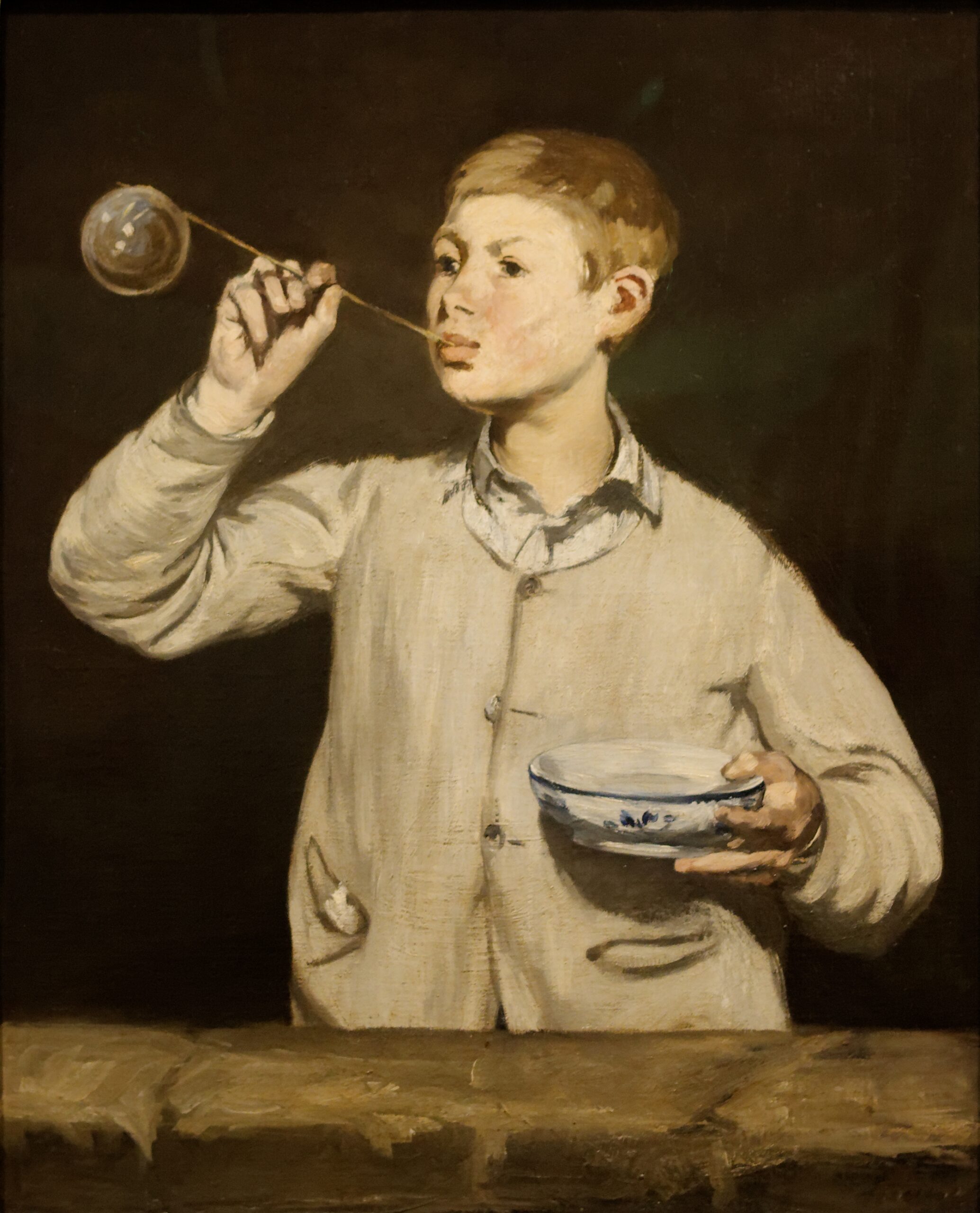
By 1867, when his submissions were rejected both by the Paris Salon and the Exposition Universelle, Manet constructed a pavilion opposite the street of the latter in Paris, where his pictures were displayed for all to see. This was the same year Boy Blowing Bubbles was created.
Édouard Manet—the eldest son of an official in the French Ministry of Justice—had early hopes of becoming a naval officer. After twice failing the training school’s entrance exam, the teenager instead went to Paris to pursue a career in the arts. There he studied with Thomas Couture and diligently copied works at the Musée du Louvre. Met Museum
Boy Blowing Bubbles was painted in 1867. It’s subject matter is 15 year old Léon Koelin-Leenhoff, the illegitimate son of Manet’s future wife, Dutch pianist Suzanne Leenhoff. The boy may have been fathered by Manet himself, but this is the subject matter for an entirely new post. I love this painting. The nearly monochrome palette and dark background are almost a love letter to the Masters which preceded Manet, such as Murillo, Frans Hals and even Rembrandt, more on the latter below. I enjoy the free and direct style of this piece. The central subject is clearly defined, the contrast between the dark background and his light clothing propel him forward in a delightful way. This painting is consistent with Manet’s Realist desire to paint modern life.
The clothing is modern, by the standards of the time, and Léon is blowing a bubble of soap, a sign of brevity of life. This seemingly strange comparison is symptomatic of the Homo Bulla Est concept (man is bubble). This concept holds that while a person (homo) may look very solid and substantial, their life is as fleeting as a bubble (bulla), insubstantial, and completely fragile (History of Bubbles). These bubbles are most commonly seen in Vanitas paintings, loosely translated from Latin as the meaninglessness of earthly life and the transient nature of vanity. A great example of this for me is the 1663 painting by Karel Dujardin, Boy Blowing Soap Bubbles, below. This is so wonderfully camp that I think I will have a fridge magnet made out of it. The child is standing on a bubble on a shell, doubly reinforcing the transience of his life. The surrealist element of the shell surfing is meant to remind us of the transience of happiness and the brevity of human life. The fabric, reflective bubbles, clouds, waves, and the depth of the perspective make this a winning painting for me. This is perhaps a silly painting but it is undeniably fun and depicted beautifully.
… the artist’s first champion, Émile Zola, had published a lengthy and glowing article about Manet. “The future is his,” Zola proclaimed. He insisted that the much-maligned Déjeuner sur l’herbe (which was included in Manet’s 1867 exhibition) would one day hang in the Louvre. Zola proved prophetic; it took almost seventy years, but the painting entered the collection of the Louvre (now Musée d’Orsay) in 1934. Met Museum
Finally, I would like to highlight one final bubble painting which I have stumbled upon during my research for this post. Cupid Blowing Soap Bubbles by Rembrandt, painted in 1634, serves as an early example of the Hommo Bulla Est concept. Cupid was the son of Mercury and, in Greek mythology, represents love in all its varieties. The bubble we have already covered. Therefore putting these together, this ostensibly cheery portrait is actually somewhat pessimistic about the longevity of love. I adore the depiction of the wings and the bubble itself. I also cannot help but notice that Cupid looks a little bit like Rembrandt himself!
I hope these three or four paintings have brought a small amount of joy into your day. Thank you for sticking with me through this soapy post!
“quod, ut dicitur, si est homo bulla, eo magis senex”
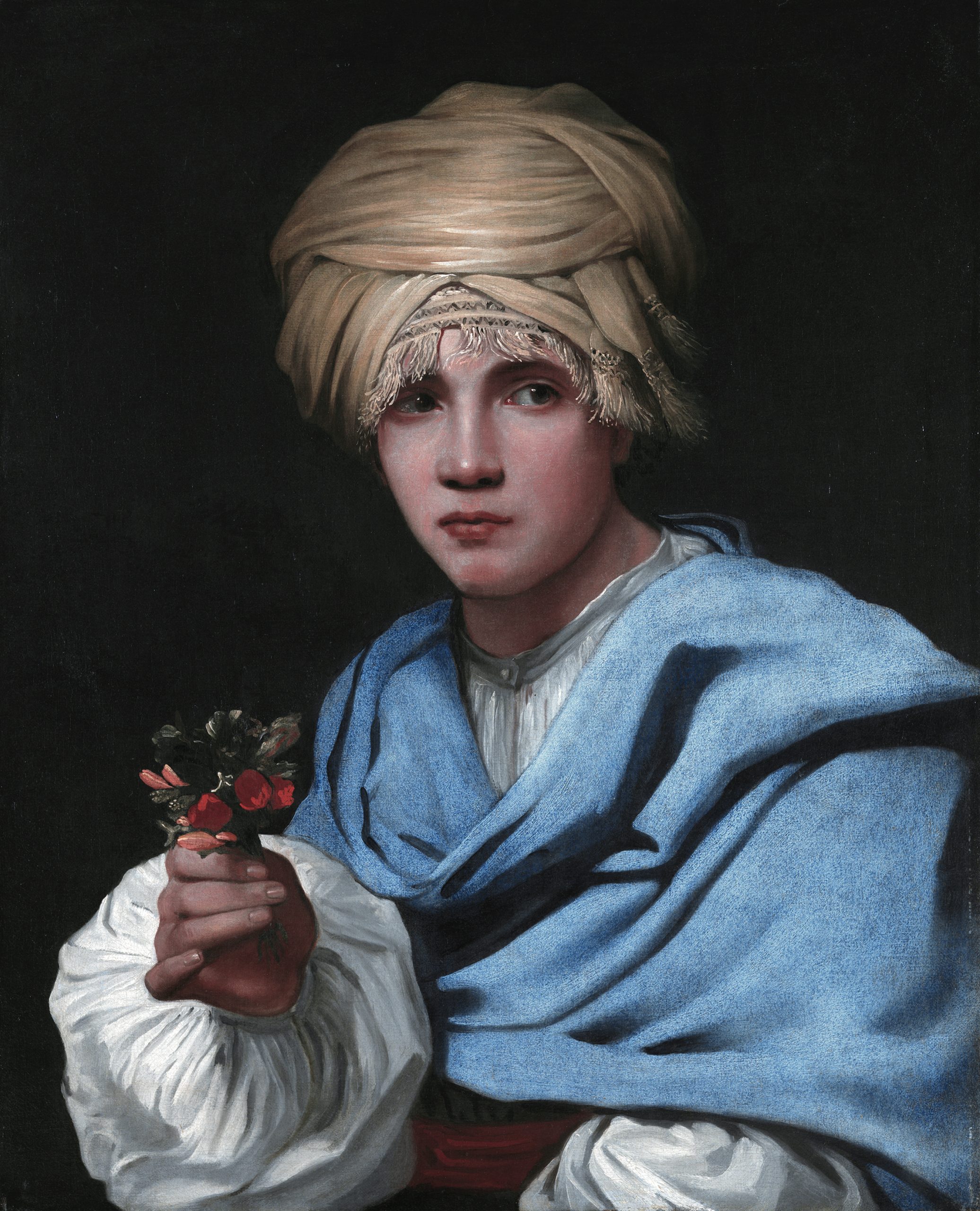
Housed at the extraordinary Museo Nacional Thyssen-Bornemisza, Madrid, Boy in a Turban Holding a Nosegay is a masterpiece by Michael Sweerts (1618-1664). Sweerts was a Flemish painter most recognised for his allegorical and genre paintings as well as portraits and tronies (common type, or group of types, of works common in Dutch Golden Age painting and Flemish Baroque painting that show an exaggerated facial expression or a stock character in costume.) Sweerts was rather a busy painter, having worked in Rome, Brussels, Amsterdam, Persia and India (Goa). It may interest the reader to know I have been to all of these places except Persia, but the night is young. Equally I did go to Bruges rather than Brussels in the Before Time but these are small details.
Boy in a Turban holding a Nosegay has been associated with the group of paintings that Sweerts executed at the end of his Amsterdam period. The subject of the present painting and the sex of the figure have been the focus of debate and have given rise to different interpretations. The gentle, delicate features and the turban hiding the hair make it difficult to define the subject precisely, and the canvas was previously entitled Figure in a Turban. It was only in 1958, when the painting was included in an exhibition on Sweerts in Rotterdam, that the sitter was described as a boy, a reading that has been maintained in the present day.
The fact that the boy is holding a nosegay has led to the suggestion that this is a representation of the sense of Smell. Sweerts executed two, now dispersed, series on the Five Senses. In one series, which uses a similar format to the present painting, five male figures in exotic dress hold objects and animals related to the senses. Museo Thysen
When I was last in Madrid I did not take the opportunity to visit this museum preferring instead to go to the Prado and the Royal Palace where I saw a miniature version of my favourite sculpture in the world, which can be found in the Cappella Sansevero in Naples. See the miniature below, which I first beheld in the Carlos III. Majestad y Ornatos exhibition.
But I digress, see below the painting which is the subject of this post:
This for me is absolutely astounding work. The clarity of the skin is lovely, the light falling on the turban is particularly gorgeous. If you look at the eyes you can see them watering slightly. The strands of the patterned undergarment of the turban is exceptionally well done.
The highlight of this painting for me is the nail depiction. The flowers in the nose gay are a little crude in comparison to this. But with the overall impression this has left on me I can forgive Mr Sweerts. The nails are just immaculate. The colour is perfect, the shape is perfect, the sheen is extraordinary. And the shade from the nose gay onto the hands is a particularly fine detail.
Why have I chosen this as my birthday post, I hear you ask? Well this painting has given me a reason to reminisce about the wonderful time I spend in Madrid and made me consider a future trip with M. Equally it is undeniably a masterly work of supreme skill from my preferred period in art. I cannot but appreciate the overall excellence of this painting. In short, it has made me rather happy. And being rather happy is all I want on this most special milestone in my headlong journey towards the grave.
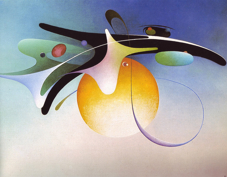
This is an obscure artist so I’ll ask you to bear with. I cannot remember where I found him but I am glad I did. This artist has provided me with a wealth of wonderfully colourful surrealist pieces, one of which I shall eventually purchase (promotions permitting) and hang on my wall. See below three of my favourite pieces by Mr Naumovski.
Vangel Naumovski was born in 1924 in the Macedonian city of Ohrid (then part of Yugoslavia). He was interested in art at a young age, but this led nowhere as he left school after third grade and worked a series of odd jobs — gardener, farmer, butcher. After a stint in the army, he enrolled in art school in Skopje in 1946, lasting a year. He then worked in a woodcarving shop in Ohrid for thirteen years. During this time he was painting, initially in a folk myth style which led to him being considered a Naive artist.
In the early 60s his painting morphed into a gooey sort of surrealism. He first exhibited in Yugoslavia in the 50s, and later had one-man shows in Rome, London, Paris, and Toronto. At some point he started a gallery in his home in Ohrid (it is unknown whether it is still open). He died in 2006. Wikiart
Black Cradle of Life 1963
Why do I like this? Firstly I ought to refer you to an earlier post where I postulated that good art is personal and there isn’t a legitimate metric for whether art is objectively good or not. With this in mind and considering the above, I am quite taken by the colour combination on this one. The black and yellow and blue make for quite an enticing painting. I suppose from the title that this is supposed to represent something seedy (pardon the pun). I think it’s lovely.
Green Oasis is a joyful surrealist piece. I love the vibrant colours swimming together and almost tied up with the exquisite fronds in a way which is creative and fun. These dream like visuals are impressive and quite precise. The contrast between the large blobs of colour and the minor ‘roots’ are appealing to me. And in the end, I think it is great fun, which is what counts.
Horizontal Galaxy 1980
One of Naumovski’s later pieces is Horizontal Galaxy. I particularly enjoy the bright background of this in contrast to the colours in the globules of galaxy and the fine lines which remind me somewhat of caramelised onions when they are overdone. I love the geometric shapes and especially the blues.
These pieces probably don’t mean anything and won’t have great reverberations in the wider art world but I like them. And this is my blog. I enjoyed these very much and hope you do also.
Hanna Hirsch Pauli (1864-1940) was a Swedish scenery and portrait painter. She was a friend of Eva Bonnier, whom she followed through the painting school of August Malmström, and the Royal Swedish Academy of Arts in Stockholm. It is currently in the Nationalmuseum in Sweden. Breakfast Time played a role in Pauli’s breakthrough in the Nordic art scene in the 1880s. Let’s have a look at it below.
As was the case with most other Swedish artists of her generation, her painting stood closer to the French juste milieu painters than to most impressionists; nevertheless, the thickly applied paint she used to show specks of light on the white tablecloth on her 1887 painting Frukostdags (Breakfast Time) (in Nationalmuseum, Stockholm) provoked one critic to comment that she had probably used the cloth to clean her brushes. Wikipedia
This is major to me. Initially it did not please Swedish critics, they say Pauli’s techniques as too radical at the time it was completed in 1887. The light in this work is superb. The brushwork at intervals which does not blend or touch other brush strokes is phenomenal. The light spot fields which result from broad brushwork, too, was really innovative.
Breakfast Time, for me, is replete with wonderful masterful detail. My favourite part is the large kettle in the centre of the table. The brush work makes the kettle so realistic, I find it quite staggering. Secondly, I adore the blue glass sugar or yoghurt holder. All the glass ware on the table and the lighting effects which highlight the points at which the light is going through them is deeply impressive to me.
In addition, the perspective work on this painting is great, the large bench in the foreground, followed by the table and lastly the maid bringing additional breakfast provisions are all done very well. The light on the tablecloth implying the tree out of the painting is the final highlight I would like to bring to your attention.
This is such a wonderful painting to me, it made my day when I first saw it. I hope it has brightened yours.
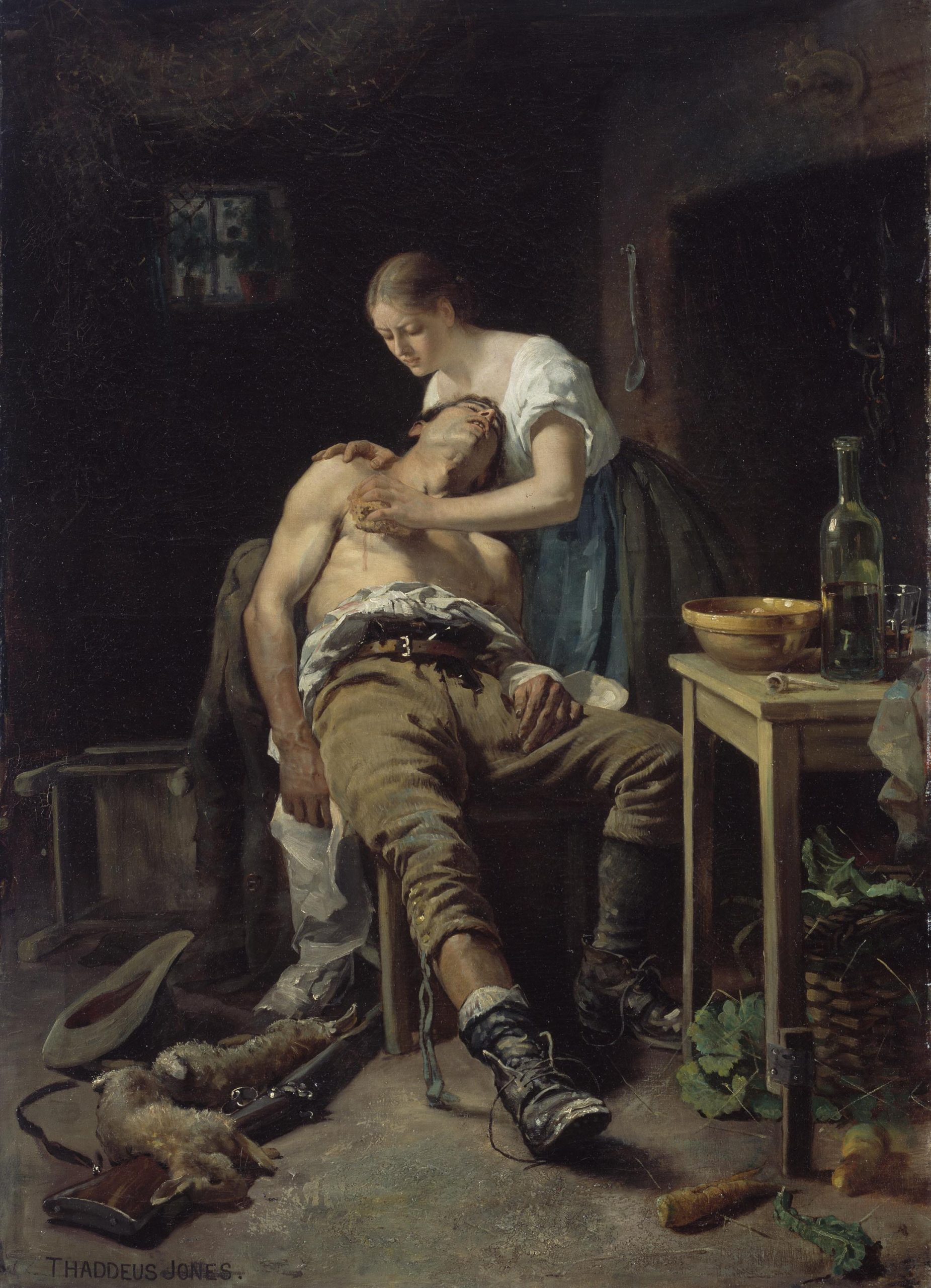
Le retour du braconnier otherwise known as The Wounded Poacher is a painting by Henry Jones Thaddeus, completed in 1881. It now lives in the National Gallery of Ireland, where we were supposed to go in March. Unfortunately a little global effect occurred which prevented us from doing so. This was most unfortunate indeed.
Henry Jones Thaddeus was an Irish painter born and trained in County Cork. He won the Taylor prize twice in 1878 and 1879. He was a realist artist and portrait artist, most famously perhaps commissioned to paint a portrait of Pope Pius X, seen above. This post, however, shall focus on The Wounded Poacher, which Thaddeus completed in 1881.
There is a lot to be admired in this wonderful painting. The lighting is extraordinary in the first place. The sharp contrast between the poacher and the lady tending him with the bleak darkness in the background creates a short of chiaroscuro effect. Going in from here there are so many wonderful details in this painting. The little rabbit on the left prostrate over the rifle, the loosened laces and mud on the boots, the beautiful bottle and pipe on the table as well as the way the trouser leg is rolled up. Each part of this painting is depicted with such wonderful precision and accuracy. Look at the folds of the trousers and the way the lighting is depicted here. This is particularly impressive to me.
The woman tending the poacher is also depicted exquisitely well. The look of pained anguish on her face is remarkable. As is the look of immense pain in the poacher’s face, who is being tended presumably for a shot wound from an angry farmer.
Overall this is a truly exceptional piece of art and I hope you have enjoyed it as much as I have.
I do not remember how I cam across Joseph Klibanksy’s work but I shall certainly be following him keenly from now on. I am always on the lookout for unusual, unique and interesting works of art. Klibansky delivers on all three counts. Below I shall discuss a number of his excellent works in the hope of bringing this new artist to your attention.
The Thinker, 2018
The Thinker is a 2018 piece, clearly echoing its Rodin namesake, made of polished bronze and spray paint. The scale of this work is most impressive, as you will see from the below work. Rodin’s Thinker is often used to portray the idea of philosophy, Klibansky’s work seems to add a spacial element to this. What does it mean? Does it mean anything? Probably not, but it is fun. I have not yet seen spray paint over bronze, especially not detailed polished bronze like this. And the fact someone has had the foresight to cast an astronaut in bronze is striking in itself.
Leap of Faith 2018
The faithful among you will recognise this piece mirrors a passage in the Gospel about Christ carrying His cross, (John 19:17-18). Klibansky has, perhaps bafflingly, transformed Christ into an astronaut for reasons beyond my own limited comprehension. I suppose this is supposed to signify the metaphorical cross we all bear? Who is to say. I still think outside of a subjective conversation about intrinsic artistic merit, I think this piece is pretty cool, if not a tad sacrilegious.
Happily Ever After 2019
This is from the more recent Klibansky exhibition and is made of polished bronze which was then chiselled more finely with what resembles a bone saw. Where to begin with this wonderful piece? The piece depicts a fattened croc wearing a party hat and tooting a party whistle. The scales are done to perfection for me. The little feet are detailed beautifully. The tail is astonishing to me in its length and detail. This is also such a fun piece that I could not help but share it with you.
Final reflections: does this mean anything? Probably not. Is it technically impressive? I think so. Is this good art? That is entirely up to you. I had a conversation with M about whether this constitutes ‘good art’ and we concluded that in truth there is no such thing as good art. Some art has political sway, some had religious implications and can inspire, but in the end art is only as good as you, the viewer, think it is. To this end, I hope these three Klibansky pieces have brought you some joy. I encourage you to delve further into his world as it is quite exciting.
You can see the Klibansky exhibition at the House of Fine Art in Los Angeles.