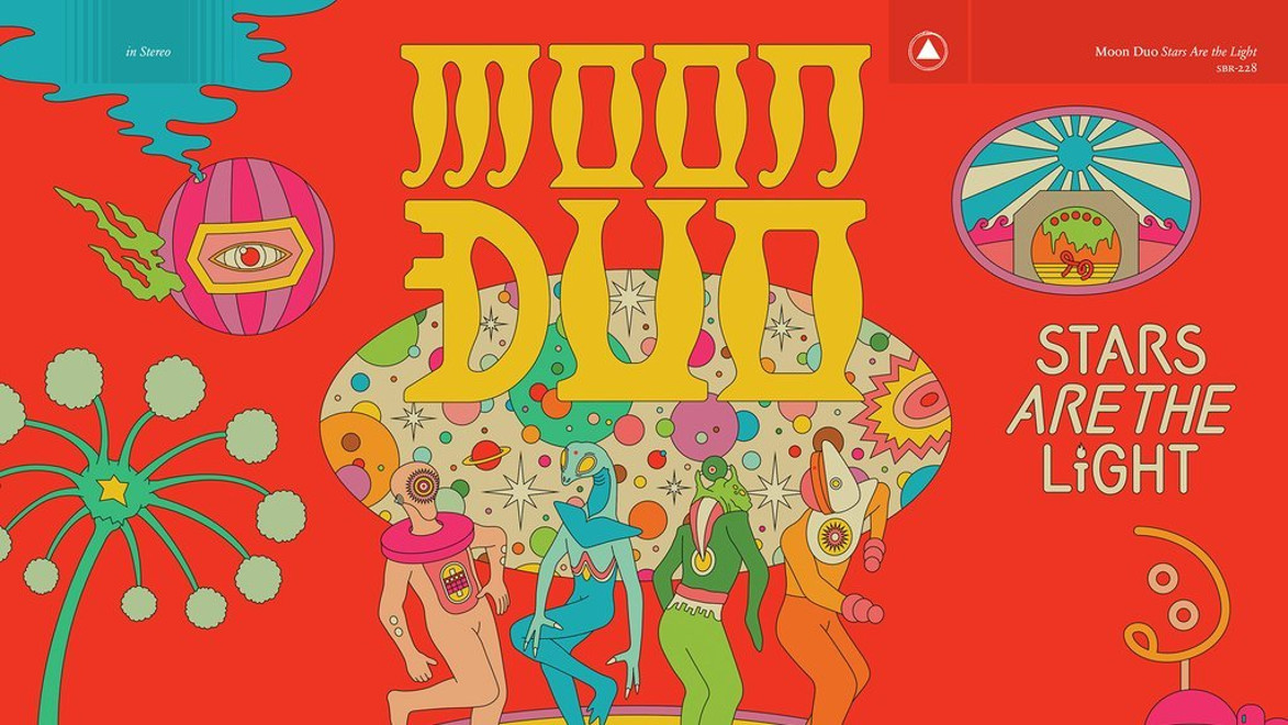
Moon Duo is a group formed in 2009 and comprises of San Francisco-based guitarist Ripley Johnson (Wooden Shjips) and keyboardist Sanae Yamada. The result of this fortuitous combination is a heady mix of swirling psychedelic space rock. Interestingly Moon Duo’s members are married. Perhaps this chemistry is what makes the sound so rich and consistent.
This post is in part a gift to my father on his birthday. I won’t tell you how old he is as this would breach parent doctor confidentiality. So thank you father, for introducing me to this wonderful album. I trust this review is to your standards. And happy birthday.
While Stars Are the Light is completely different than other Moon Duo albums, it is by no means a disappointment. It is a very groovy record, full of disco and funk beats. It was also brought to life with the help of Sonic Boom, a former member of Spaceman 3, who has also worked with Beach House. Any fan of Moon Duo or psych-rock will not be let down by Stars Are the Light. Glide
Moon Duo is split into eight tracks. The first of which is Flying. The bossanova beats and funky grooves throughout mark the opening track as quite singular in the Moon Duo cannon. Its driving bass marks the generally impressive consistency of all the tracks in this album.
The titular track follows which, for me, demonstrates the lighter more airy side of Moon Duo without compromising on the integrity or quality of the central sound. The sound is refined, positive and consuming. It envelops the listener, in part thanks to the wonderful synth stylings of Yamada.
By using splashes of guitar as punctuation points, synth work is pushed to the forefront, this works wonders on “The World And The Sun” which takes a funky but meandering electronic track which goes nowhere, albeit pleasantly until washes of atmospheric synth work elevates the track into glorious synthesised euphoria. Even better, “Lost Heads” has the duo’s vocals intertwining sweetly over the monotonous structure of electronica and nagging keyboard riffs, the otherworldy nature is akin to being awake in a dream. The Line of Best Fit
Eternal Shore is delightful and upbeat. The guitar work, as seen in Wooden Shjips, is wonderful and complex. Once again the drive in this track is consistent with the rest of those in this album.
Finally, Fever Night is a suitably grand ending to this album. It encapsulates the enveloping sound of Moon Duo and is a track very much in line with the musical aesthetic of the band.
My final three reflections on this album are as follows:
Stars Are the Light provides a precise, enveloping synth sound
Moon Duo have provided a wonderfully idiosyncratic album
This album is a big concept with excellent execution
Overall I remain impressed by this album and listen to it often, especially when I have to concentrate on complex legal texts. I hope you do too, though I hope you do not have to be subject to legal analysis while listening to any music.
This is an obscure artist so I’ll ask you to bear with. I cannot remember where I found him but I am glad I did. This artist has provided me with a wealth of wonderfully colourful surrealist pieces, one of which I shall eventually purchase (promotions permitting) and hang on my wall. See below three of my favourite pieces by Mr Naumovski.
Vangel Naumovski was born in 1924 in the Macedonian city of Ohrid (then part of Yugoslavia). He was interested in art at a young age, but this led nowhere as he left school after third grade and worked a series of odd jobs — gardener, farmer, butcher. After a stint in the army, he enrolled in art school in Skopje in 1946, lasting a year. He then worked in a woodcarving shop in Ohrid for thirteen years. During this time he was painting, initially in a folk myth style which led to him being considered a Naive artist.
In the early 60s his painting morphed into a gooey sort of surrealism. He first exhibited in Yugoslavia in the 50s, and later had one-man shows in Rome, London, Paris, and Toronto. At some point he started a gallery in his home in Ohrid (it is unknown whether it is still open). He died in 2006. Wikiart
Black Cradle of Life 1963
Why do I like this? Firstly I ought to refer you to an earlier post where I postulated that good art is personal and there isn’t a legitimate metric for whether art is objectively good or not. With this in mind and considering the above, I am quite taken by the colour combination on this one. The black and yellow and blue make for quite an enticing painting. I suppose from the title that this is supposed to represent something seedy (pardon the pun). I think it’s lovely.
Green Oasis is a joyful surrealist piece. I love the vibrant colours swimming together and almost tied up with the exquisite fronds in a way which is creative and fun. These dream like visuals are impressive and quite precise. The contrast between the large blobs of colour and the minor ‘roots’ are appealing to me. And in the end, I think it is great fun, which is what counts.
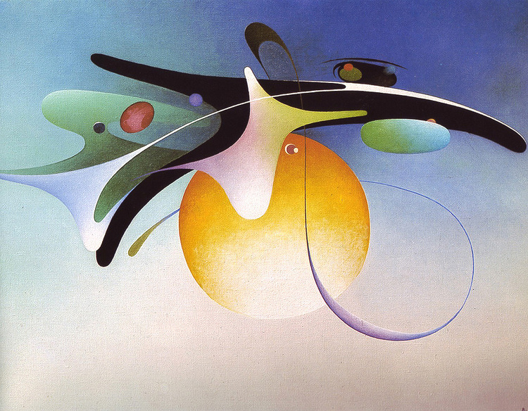
Horizontal Galaxy 1980
One of Naumovski’s later pieces is Horizontal Galaxy. I particularly enjoy the bright background of this in contrast to the colours in the globules of galaxy and the fine lines which remind me somewhat of caramelised onions when they are overdone. I love the geometric shapes and especially the blues.
These pieces probably don’t mean anything and won’t have great reverberations in the wider art world but I like them. And this is my blog. I enjoyed these very much and hope you do also.
This is an album which has so surprised and delighted me that I have not been able to stop listening to it for the last two months and felt I needed to share with you. This was an album released in 1986 and largely commercially ignored until the artist was 72 (2016).
The artist responsible is Beverly Glenn-Copeland, a man endowed with such rare fortune that he remained more or less a non-entity to the music-curious public until the age of 72 when a particularly influential record collector from Japan sent him a life-altering email asking for any remaining physical copies of his early music. Deep into a peaceful, years-long toil in the Canadian hinterlands with his wife, Copeland was suddenly faced with the task of living his way out of a placid, relatively private existence, and into one in which documentarians tour his home like a museum and take seriously his thoughts on the intersection between science and the divine. Pitchfork
Copeland bought an Atari computer and two synthesizers—the Roland TR-707 and the Yamaha DX7 to create Keyboard Fantasies, a work of, I believe, supreme and simple beauty. Pitchfork describes the album as “a sextet of chuggy, spare, somnambulant pieces built by some of the most basic preset tones from the DX7.” I am inclined to agree. The opening track, Ever New, is serene and peaceful as well as beautifully composed. Copeland’s vocal talent is the icing on the cake.
Winter Astral is a wonderfully sparse synthesizer journey which pulled me straight in. Let Us Dance may be my favourite piece on the album. The drum work and synthesized bells just blow me away. To think this is all programmed in a computer and played on a keyboard baffles me. There is a great energy and progression to Let Us Dance which borders on hypnotic.
Old Melody is almost oriental in feel and superlatively dreamy in delivery. Sunset Village is considered by many an exceptional piece and is certainly an excellent way to close this wonderful collection of songs. The final piece of Keyboard Fantasies is otherworldly in a way I struggle to describe. It treads the line between familiarity and a feeling truly alien in a beautiful way. Like so many retirement villages of the same name, the track is in a way a peaceful resting place.
I could not describe this album better than Pitchfork have in their closing paragraph:
Stare at that window long enough and you can start to imagine everything—the sea, the sky, the sand, even Copeland—in a state of total suspension, deepened by the light of a sun that seems like it takes forever to set. He has never really needed much to grant him fullness. We’re so obviously the ones that do.
I would also like to bring your attention to Glenn Copeland’s debut album which is self titled:
The folk is freaky. The riffs are seraphic. With all the leider residue in his arias and tremolos, these albums feel like songbooks of spirituals for the unspiritual. There have been obvious parallels made to Joni Mitchell in the music’s blueness and timbre—especially in how Copeland warbles like god has just asked him a difficult favor—but a more fitting comparison would be to Judee Sill, an artist who shares with him an alloy of Christian folklore, Bach-indebted chord progressions, and a sense of servitude to a quiet, inarticulable secret. “By and large, the early music was looking at death, love and the difficulty of love,” he once indifferently summed, though I would argue that a track like “Untitled (Make the Answer Yes),” is the sort of song that one could sensibly choose to be buried to. Pitchfork
I hope both these albums bring to you as profound a joy as they brought me.
Hanna Hirsch Pauli (1864-1940) was a Swedish scenery and portrait painter. She was a friend of Eva Bonnier, whom she followed through the painting school of August Malmström, and the Royal Swedish Academy of Arts in Stockholm. It is currently in the Nationalmuseum in Sweden. Breakfast Time played a role in Pauli’s breakthrough in the Nordic art scene in the 1880s. Let’s have a look at it below.
As was the case with most other Swedish artists of her generation, her painting stood closer to the French juste milieu painters than to most impressionists; nevertheless, the thickly applied paint she used to show specks of light on the white tablecloth on her 1887 painting Frukostdags (Breakfast Time) (in Nationalmuseum, Stockholm) provoked one critic to comment that she had probably used the cloth to clean her brushes. Wikipedia
This is major to me. Initially it did not please Swedish critics, they say Pauli’s techniques as too radical at the time it was completed in 1887. The light in this work is superb. The brushwork at intervals which does not blend or touch other brush strokes is phenomenal. The light spot fields which result from broad brushwork, too, was really innovative.
Breakfast Time, for me, is replete with wonderful masterful detail. My favourite part is the large kettle in the centre of the table. The brush work makes the kettle so realistic, I find it quite staggering. Secondly, I adore the blue glass sugar or yoghurt holder. All the glass ware on the table and the lighting effects which highlight the points at which the light is going through them is deeply impressive to me.
In addition, the perspective work on this painting is great, the large bench in the foreground, followed by the table and lastly the maid bringing additional breakfast provisions are all done very well. The light on the tablecloth implying the tree out of the painting is the final highlight I would like to bring to your attention.
This is such a wonderful painting to me, it made my day when I first saw it. I hope it has brightened yours.
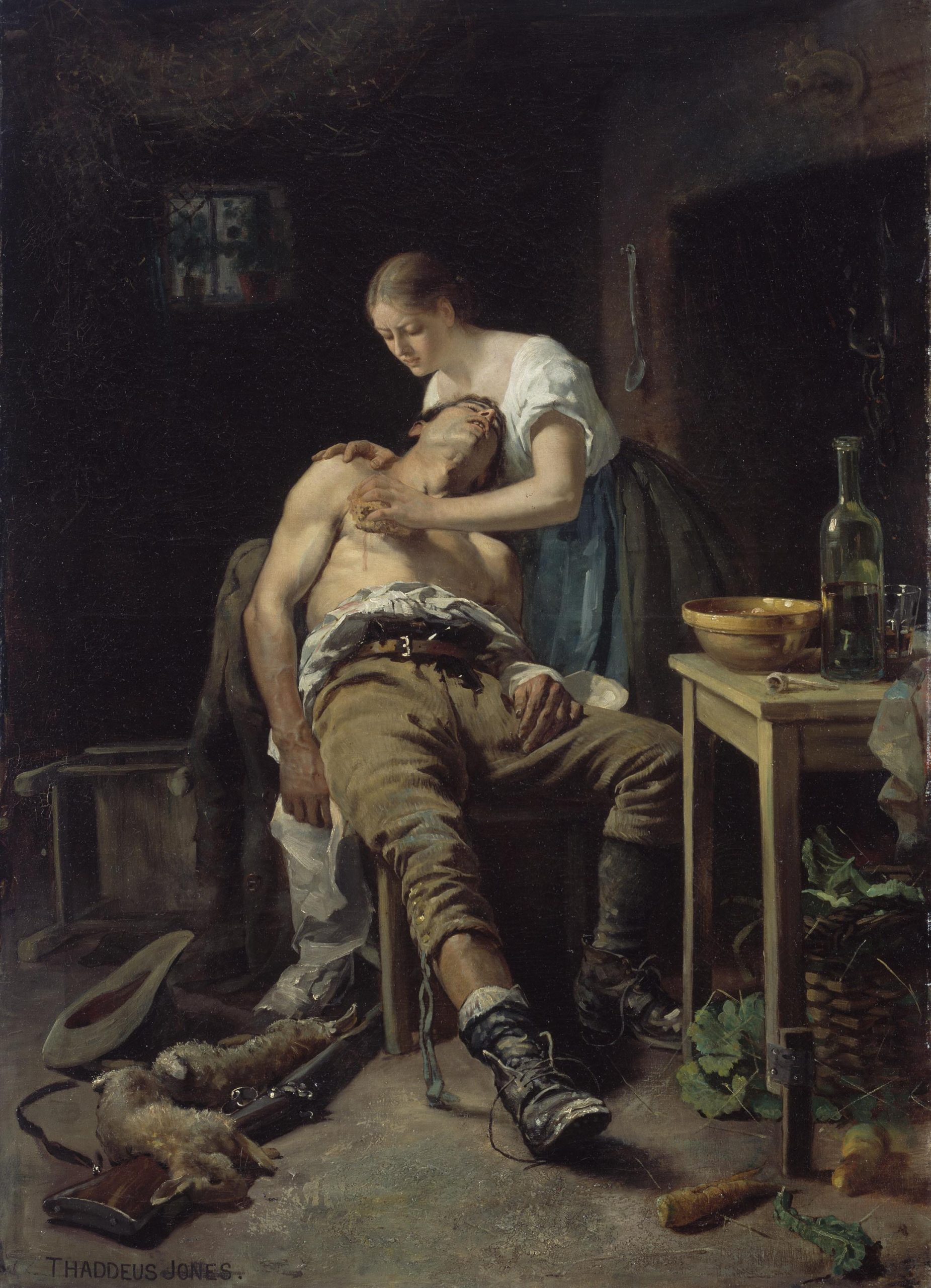
Le retour du braconnier otherwise known as The Wounded Poacher is a painting by Henry Jones Thaddeus, completed in 1881. It now lives in the National Gallery of Ireland, where we were supposed to go in March. Unfortunately a little global effect occurred which prevented us from doing so. This was most unfortunate indeed.
Henry Jones Thaddeus was an Irish painter born and trained in County Cork. He won the Taylor prize twice in 1878 and 1879. He was a realist artist and portrait artist, most famously perhaps commissioned to paint a portrait of Pope Pius X, seen above. This post, however, shall focus on The Wounded Poacher, which Thaddeus completed in 1881.
There is a lot to be admired in this wonderful painting. The lighting is extraordinary in the first place. The sharp contrast between the poacher and the lady tending him with the bleak darkness in the background creates a short of chiaroscuro effect. Going in from here there are so many wonderful details in this painting. The little rabbit on the left prostrate over the rifle, the loosened laces and mud on the boots, the beautiful bottle and pipe on the table as well as the way the trouser leg is rolled up. Each part of this painting is depicted with such wonderful precision and accuracy. Look at the folds of the trousers and the way the lighting is depicted here. This is particularly impressive to me.
The woman tending the poacher is also depicted exquisitely well. The look of pained anguish on her face is remarkable. As is the look of immense pain in the poacher’s face, who is being tended presumably for a shot wound from an angry farmer.
Overall this is a truly exceptional piece of art and I hope you have enjoyed it as much as I have.
I do not remember how I cam across Joseph Klibanksy’s work but I shall certainly be following him keenly from now on. I am always on the lookout for unusual, unique and interesting works of art. Klibansky delivers on all three counts. Below I shall discuss a number of his excellent works in the hope of bringing this new artist to your attention.
The Thinker, 2018
The Thinker is a 2018 piece, clearly echoing its Rodin namesake, made of polished bronze and spray paint. The scale of this work is most impressive, as you will see from the below work. Rodin’s Thinker is often used to portray the idea of philosophy, Klibansky’s work seems to add a spacial element to this. What does it mean? Does it mean anything? Probably not, but it is fun. I have not yet seen spray paint over bronze, especially not detailed polished bronze like this. And the fact someone has had the foresight to cast an astronaut in bronze is striking in itself.
Leap of Faith 2018
The faithful among you will recognise this piece mirrors a passage in the Gospel about Christ carrying His cross, (John 19:17-18). Klibansky has, perhaps bafflingly, transformed Christ into an astronaut for reasons beyond my own limited comprehension. I suppose this is supposed to signify the metaphorical cross we all bear? Who is to say. I still think outside of a subjective conversation about intrinsic artistic merit, I think this piece is pretty cool, if not a tad sacrilegious.
Happily Ever After 2019
This is from the more recent Klibansky exhibition and is made of polished bronze which was then chiselled more finely with what resembles a bone saw. Where to begin with this wonderful piece? The piece depicts a fattened croc wearing a party hat and tooting a party whistle. The scales are done to perfection for me. The little feet are detailed beautifully. The tail is astonishing to me in its length and detail. This is also such a fun piece that I could not help but share it with you.
Final reflections: does this mean anything? Probably not. Is it technically impressive? I think so. Is this good art? That is entirely up to you. I had a conversation with M about whether this constitutes ‘good art’ and we concluded that in truth there is no such thing as good art. Some art has political sway, some had religious implications and can inspire, but in the end art is only as good as you, the viewer, think it is. To this end, I hope these three Klibansky pieces have brought you some joy. I encourage you to delve further into his world as it is quite exciting.
You can see the Klibansky exhibition at the House of Fine Art in Los Angeles.